Shipwell RFP Automation GTM Campaign
Role: Art Direction, Design, Animator
Oh boy this was a FUN campaign (and a really great product feature)!
Peak shipping season had just passed and supply chain managers and logistics professionals alike are looking towards next year’s peak and the woes, tedium and panic it’s going to bring. They’re also looking for solutions. ANYTHING to relieve the anticipated pressure it will bring their way.
Enter a fun and helpful automation feature from Shipwell. Request for Proposal’s in any industry aren’t fun but when you’re sending out dozens, potentially hundreds? Nightmare fuel. What if there was an ‘easy button’? We’ve got it, we just need to let the world (specifically our audience) know.
The Approach
I start every campaign by looking out into the endless digital sea to check out what our competitors are doing. It was the same as always. Trucks. So. Many. Trucks. Nothing but the classic ‘logistics’ imagery you think of when you think of shipping. Sure there was the occasional screenshot of their product but no appeal to emotion or speaking to the person on the other side of the screen. A boring sea of sameness and Shipwell had been treading those same waters.
I wanted this campaign to be different. Luckily we got a brand new CMO who shared that want. Let’s appeal to the emotion of the issue, the frustration, the apprehension, the potential rage, through copy AND imagery. It might be a B2B campaign but there’s a plain ole human on the other end who will be clicking and we have microseconds to catch their attention during the daily doomscroll.
Limited budget mean sifting through stock photos to find our lead photos
Comped ads. Copy courtesy of myself and Sean Wilson.
The ‘Office Space’ moment, being caught in the past, stuck between a rock a hard place and mind numbing manual paper work. Logistics! It’s not the trucks and boxes we might think of, but for the workers using ancient processes and sub-optimal TMS platforms? That’s everyday and supremely relatable.
And a huge departure from what everyone else in the space is serving them up.
So did it work?
Does a designer wait till the last second to update their portfolio? Absolutely!
Engagement was up approx. 400% over our previous campaigns that relied on classic logistics imagery and language. The success opened the floodgates to carry this approach forward into other campaigns and we’ve been having a blast ever since. Who said B2B NEEDS to be buttoned up?
Our departure from the ‘norm’ was noticed by others and we’ve begun seeing them put out some zany ads of their own. Imitation is the sincerest form of flattery right?
The Funnel
We've covered the leading creative but what about the other campaign and assets? Where do they fall in your funnel? and SURELY you aren't leaning into this imagery alllll the way through, right? Right?
Right!
Zany, attention getting images are great for the top of the marketing funnel when you’re competing against world for the attention of the viewer but once they start their journey down funnel the creative needs to change appropriately. the further down the funnel, the more restrained and business oriented your imagery should be.
Leading imagery (covers, hero graphics on landing pages, etc) should keep that fun, out-there imagery for continuity and homogeny between campaign assets but in-line / in-body content should begin leaning into that classic branded ‘B2B’ style we all know and love (or don’t love - I won’t judge you).
With the preamble behind us, lets take a look at the rest of the assets and a little map of the campaign funnel.
Social Ads
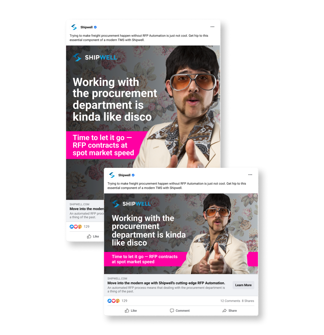
"Disco"
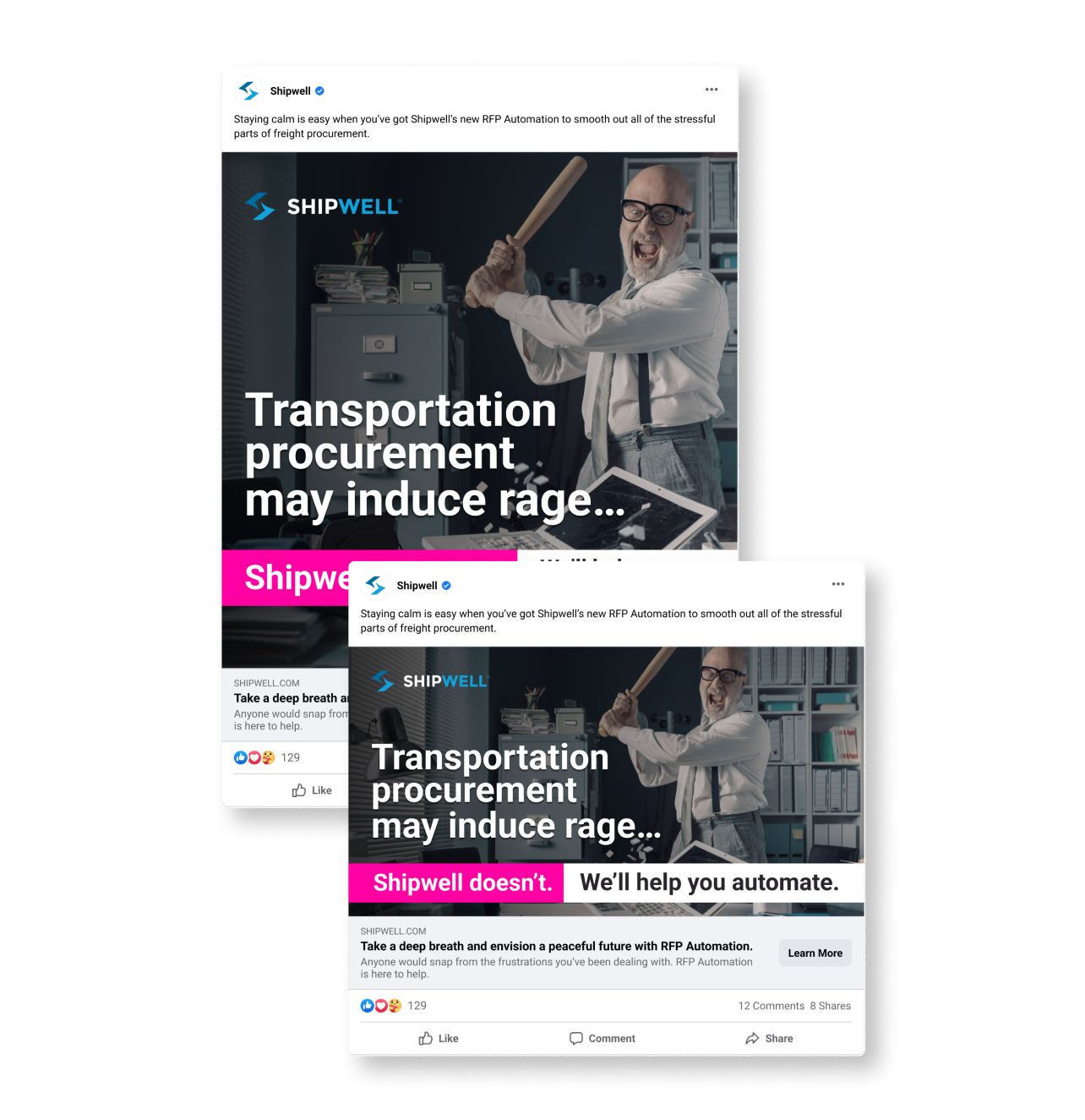
"Rage room"
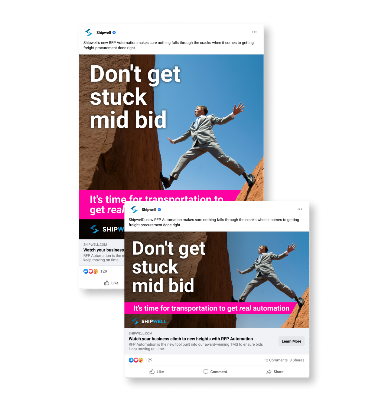
"Rock and a hard place"
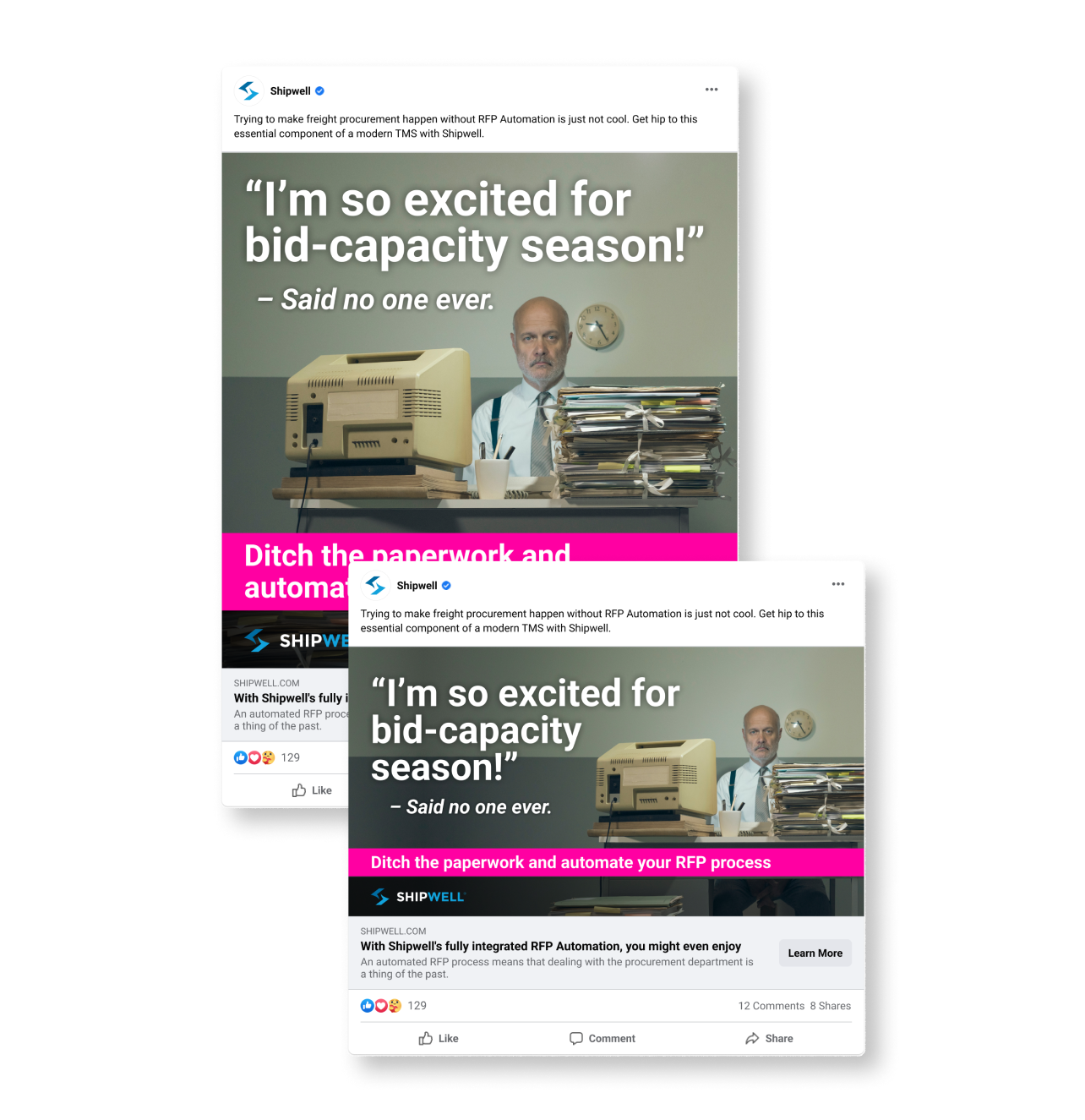
"Said no one ever"
Promo Emails
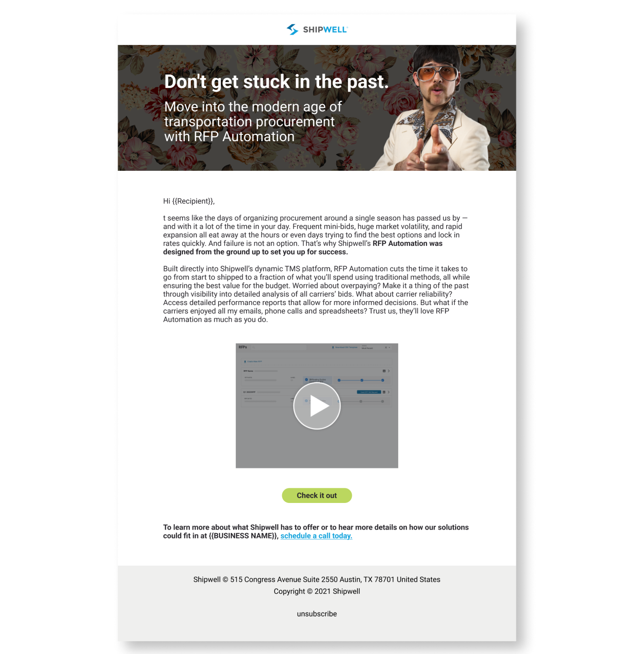
Campaign Promo Email (With demo video)
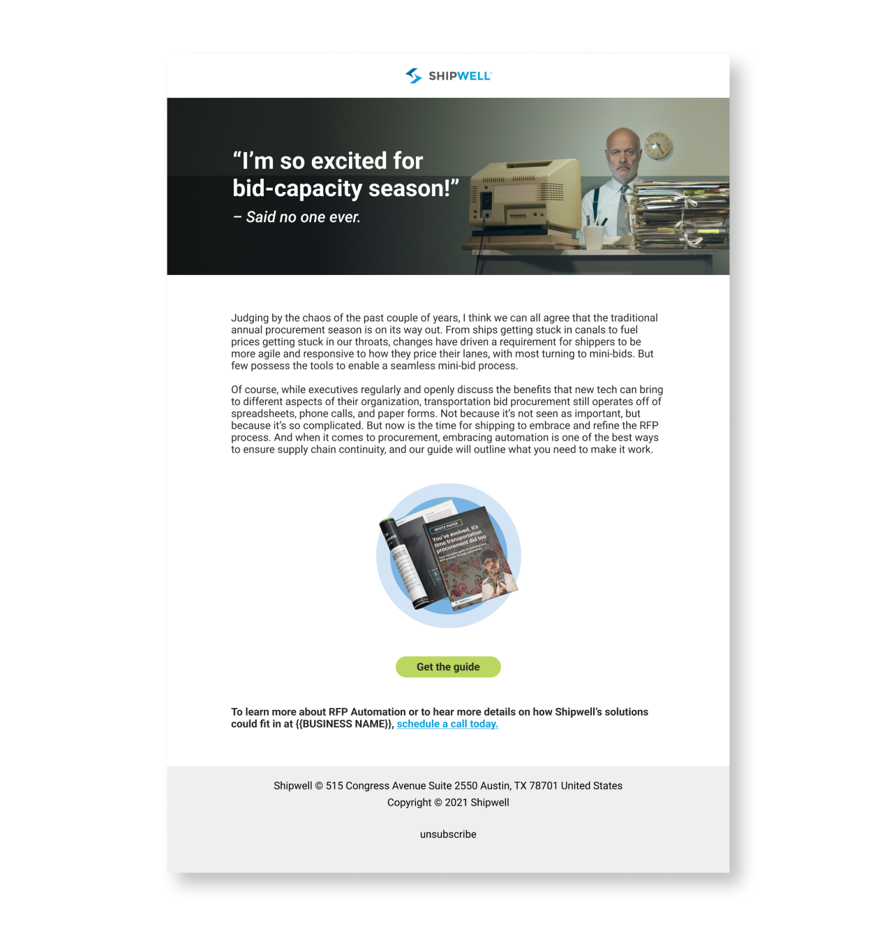
White Paper Promo Email
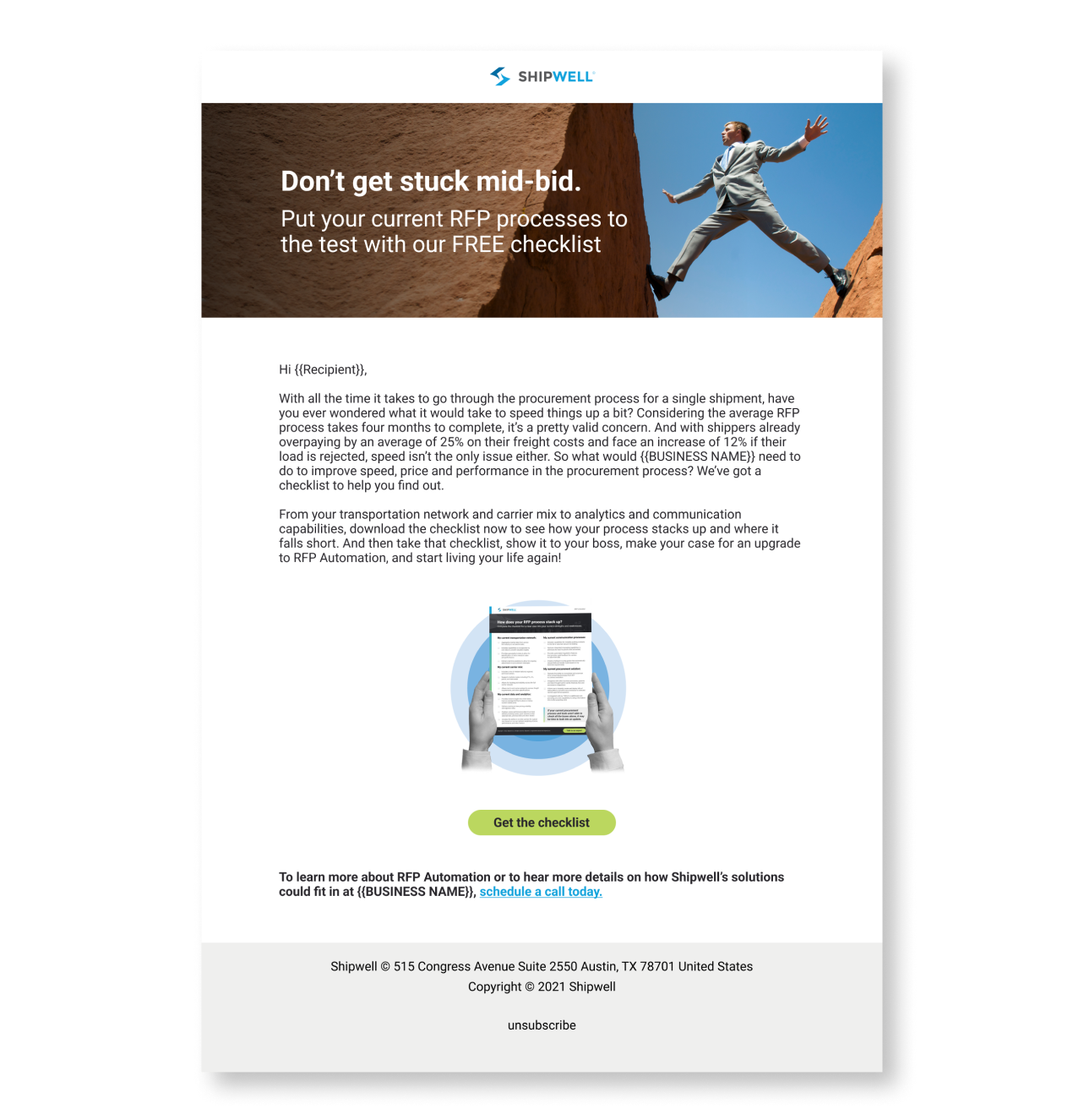
One Pager Promo Email
Campaign Landing Page
White Paper Asset, LPs and Email
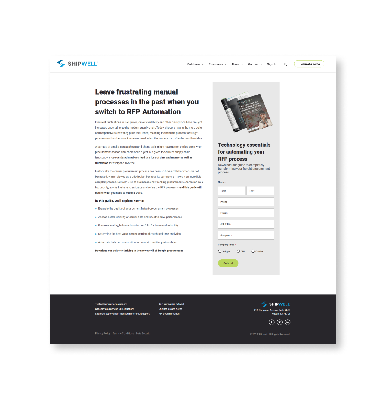
White Paper Gated LP
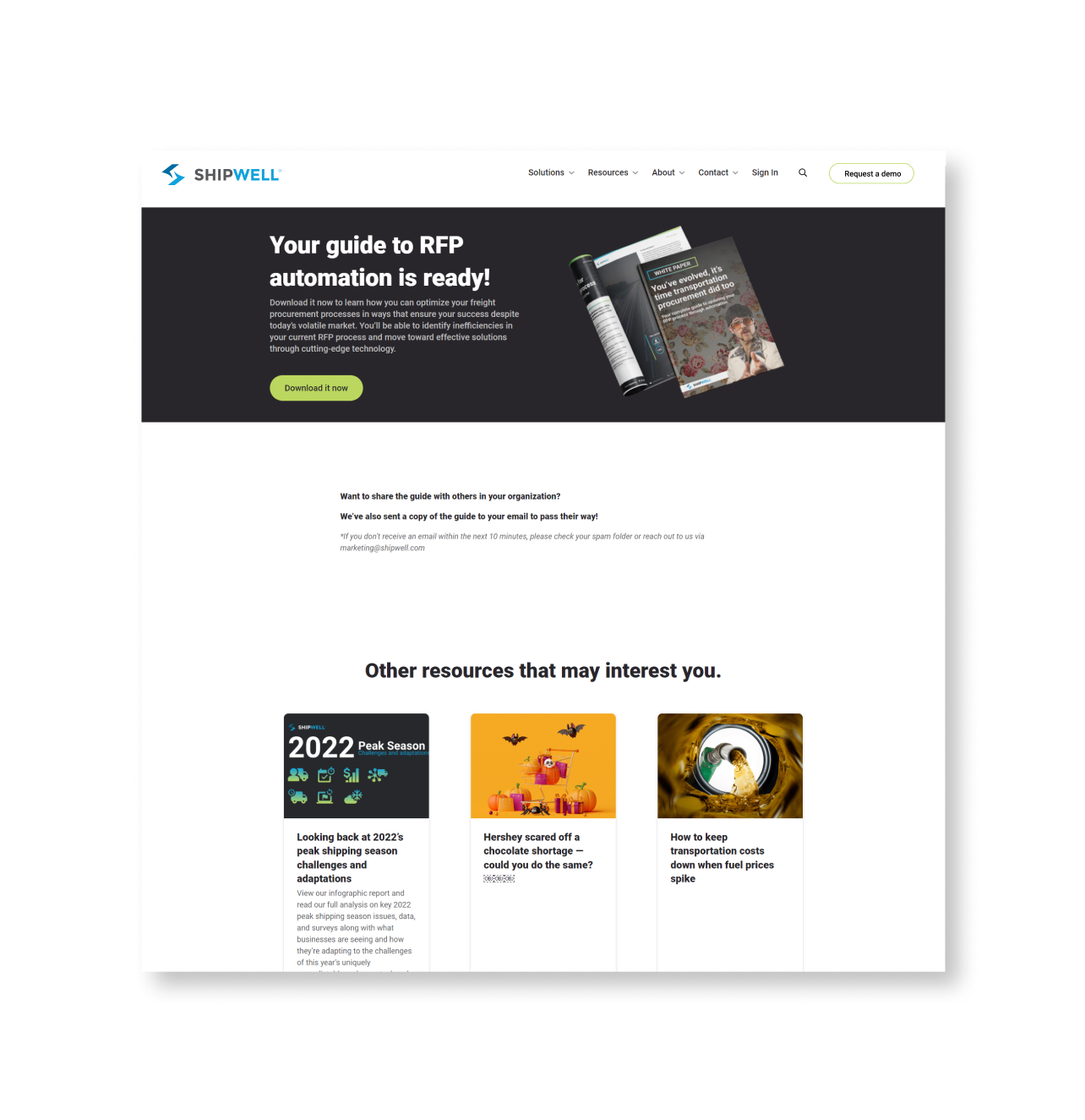
White Paper Thank You Page
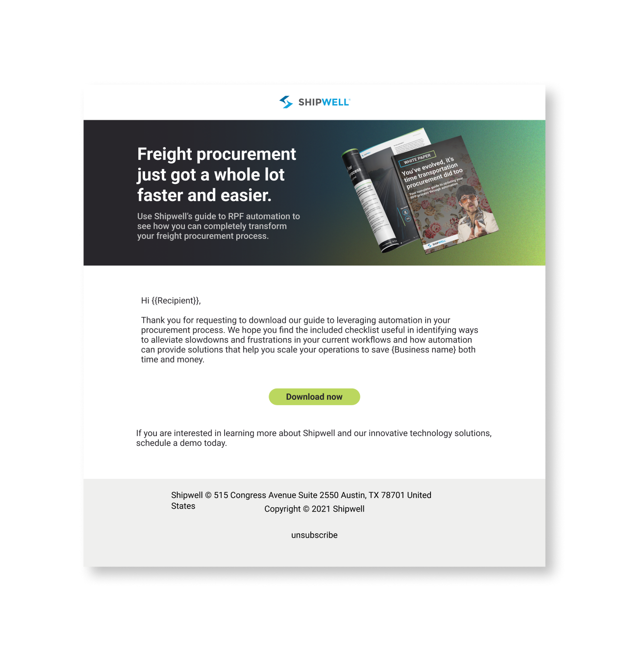
White Paper Thank You Email
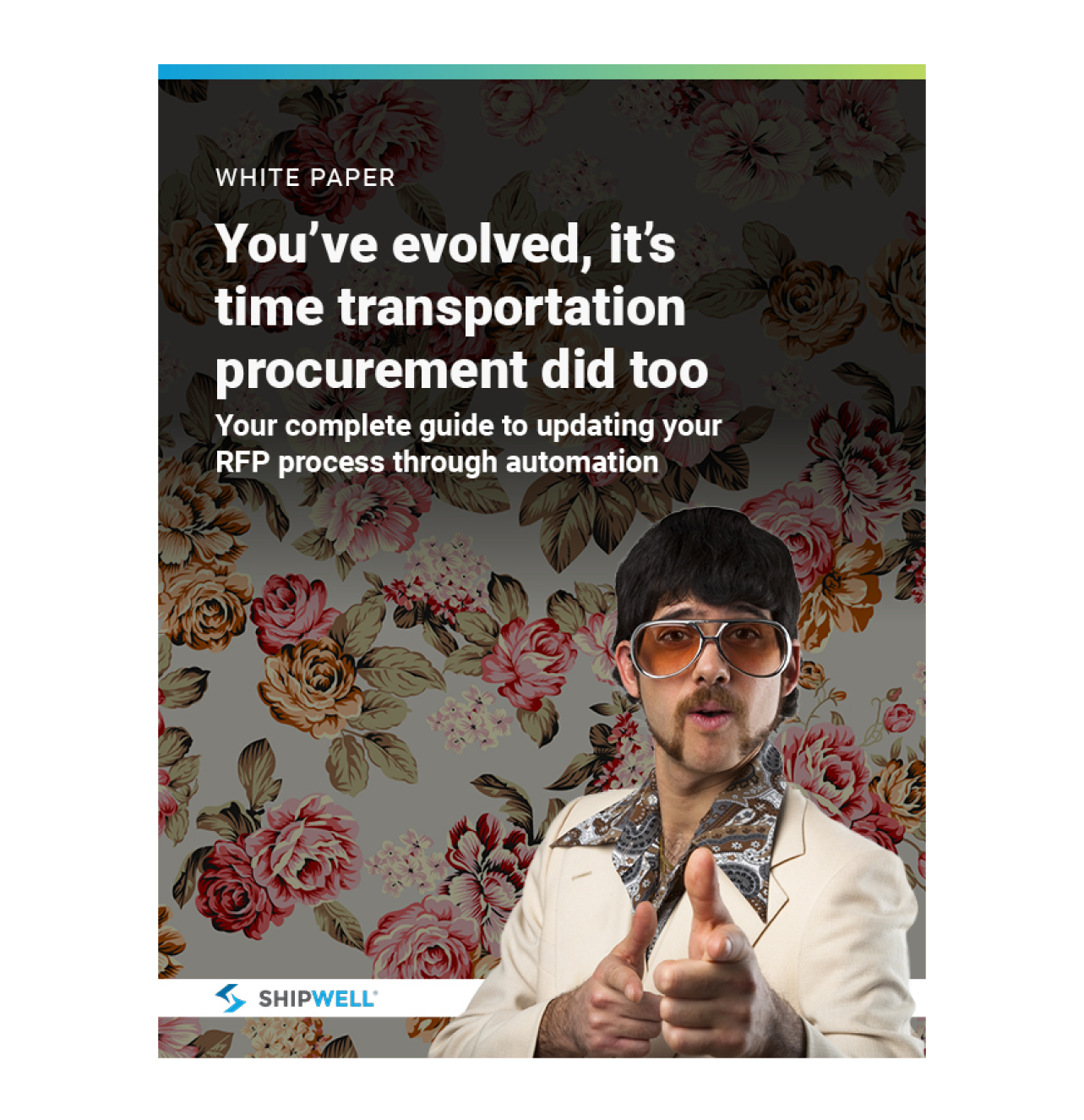
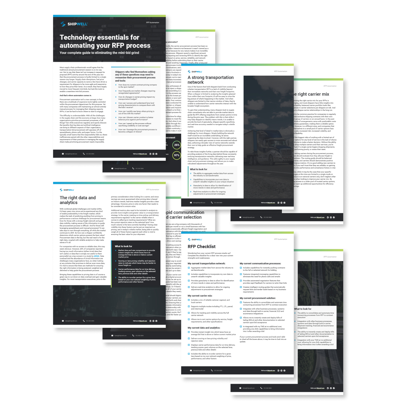
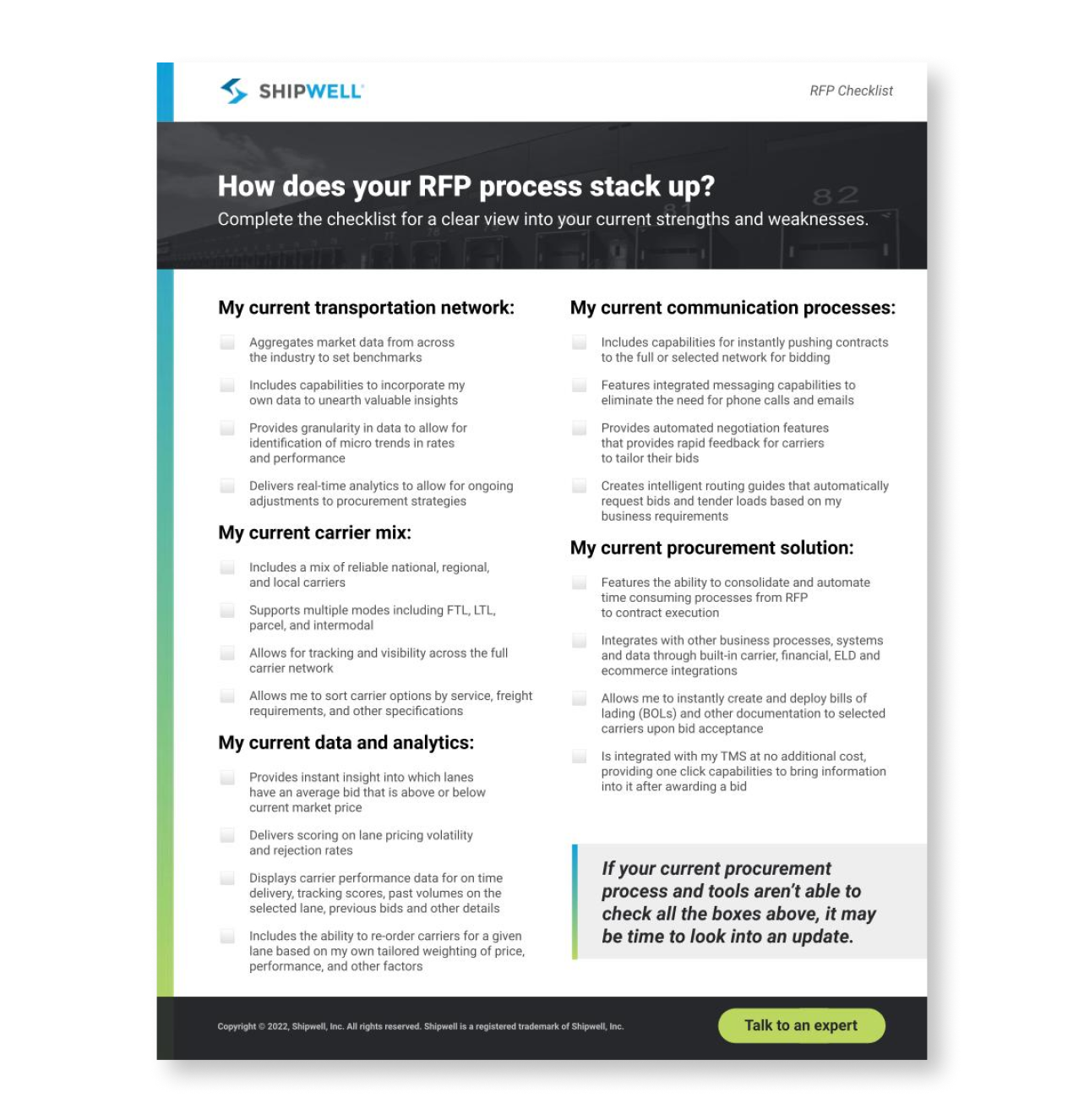
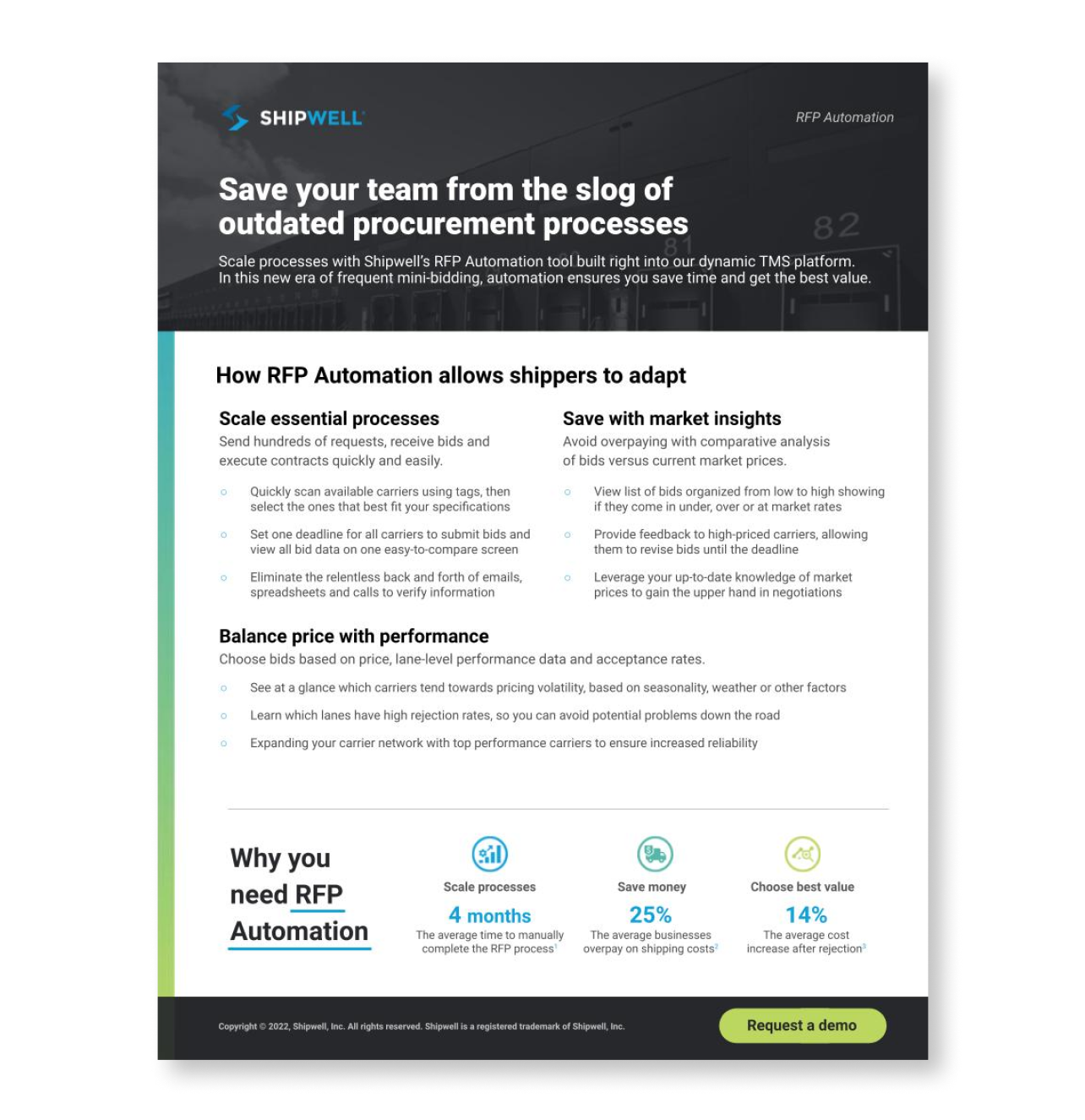
One Pager Asset, LPs and Email
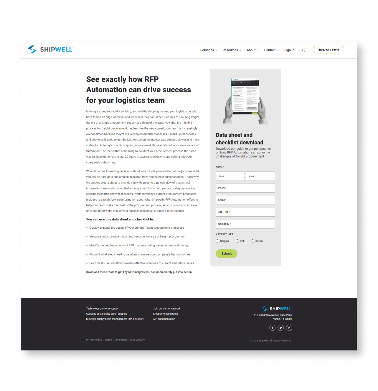
One Pager Gated LP
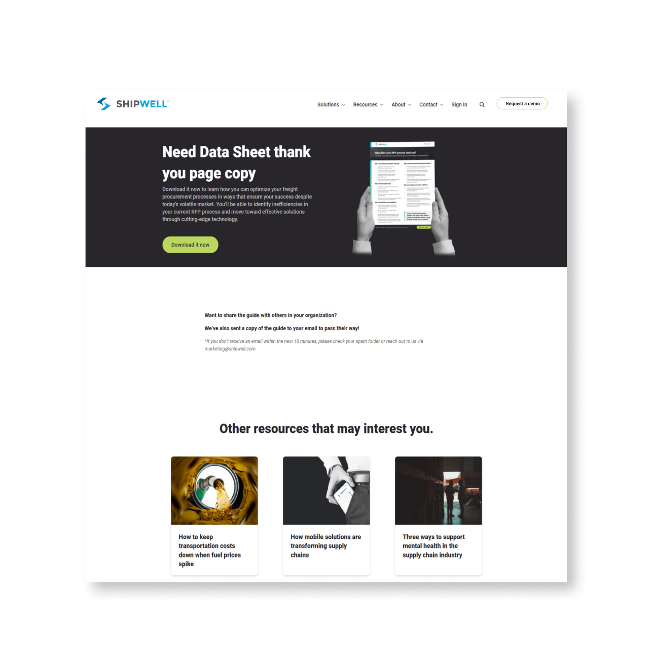
One Pager Thank You Page
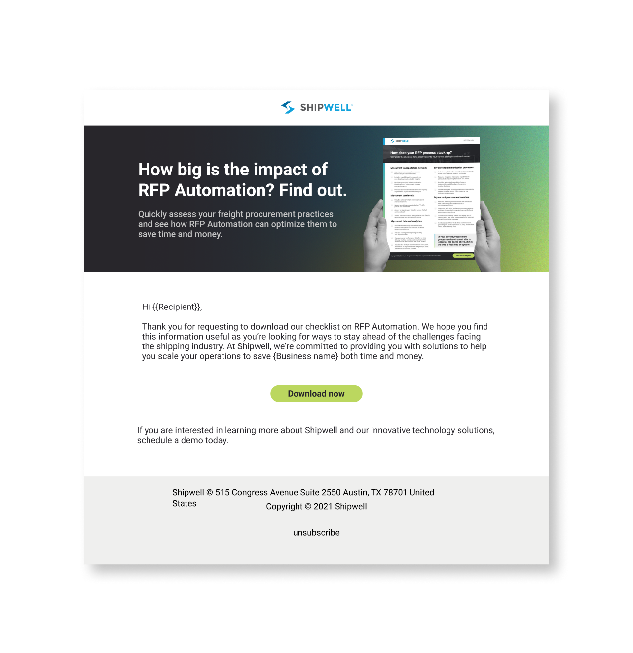
One Pager Thank You Email
Demo Video + UI Animation
Video and UI Animations by me. VO courtesy of our talented Sr. Pre-Sales Engineer, Larry Lewis.